Following a tutorial to try Claude Design + Midjourney: a cyberpunk game landing page
Source / credit: This is my hands-on write-up of following the YouTube tutorial Claude Design = Easy Websites for Beginners. The whole workflow (using Claude Design to generate the page + Midjourney for the imagery) and the design direction are from that video, not my own invention. What follows is the process I went through, the result, and what I learned.
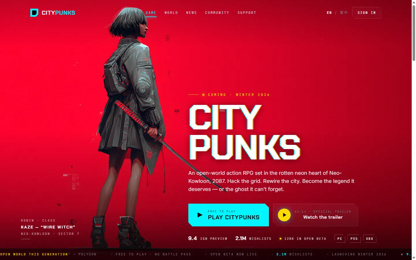
What I wanted to learn was this AI website-generation workflow — Claude Design for the design and code, Midjourney for the images. To practise, I picked a marketing landing page for a fictional cyberpunk open-world RPG called “Citypunks.”
👉 See the live page here — the raw AI prototype, with a tweaks panel in the corner to try the five palettes and atmosphere effects live.
Step 1 — Claude Design: one wireframe prompt
The tutorial’s approach is to give no visual direction, just describe the structure in plain words and let Claude lay out the design. I followed that and used this prompt:
Create me a wireframe for a cyberpunk type game.
Large Video hero with H1 and CTA bottom left. I want a button/box that has a cta for watching the trailer, and a main cta to play the game.
The game should be called Citypunks.
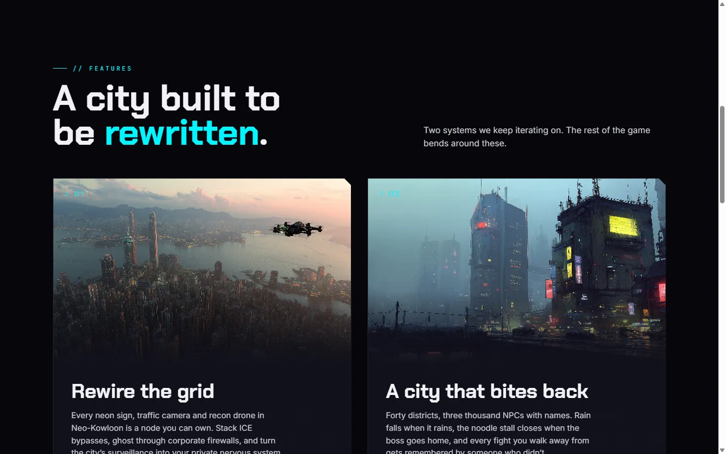
The second section should be 2 features about the game
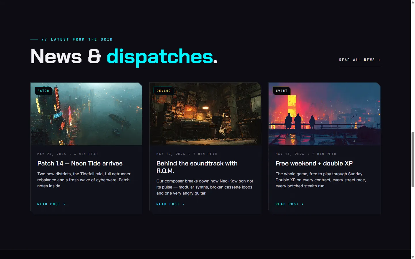
Then a news section for updates from the game, 3 posts and a link to read more.
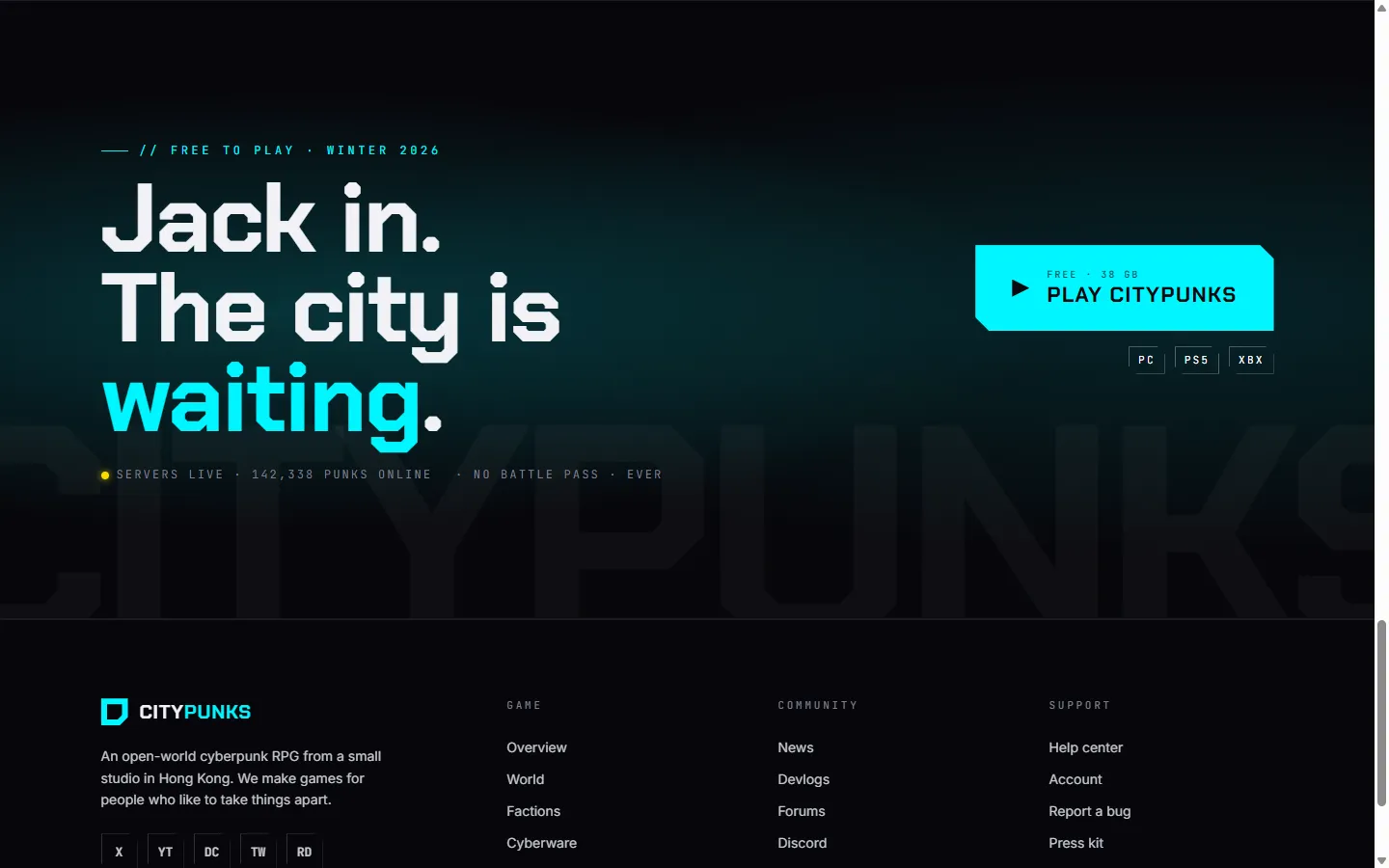
And a big full width CTA section to play the game and a footer.
What came back went far beyond the brief
I expected a grey-box wireframe. Instead Claude delivered a high-fidelity, complete design (the one in the bento above), deciding on its own a lot of things I never asked for. My brief was six sentences; Claude filled in an entire design system around it:
- A signature visual language — every card, button and chip uses the same
clip-pathcorner cut (14px / 8px variants), making the whole page feel cohesive and unmistakably “tech.” - Five runtime-swappable palettes — the default “Crimson ronin” (cyan + yellow), plus hot pink, acid green, blood amber and ice blue. I never asked for colour options; it built a palette system anyway.
- An atmosphere layer — scanlines, film grain, and a chromatic-aberration glitch on the H1, all toggleable.
- Full responsiveness — collapsing from 1440px down to 360px across five breakpoints, with the hero background shift and a burger-to-X menu morph worked out.
- Detail down to the type scale, spacing baseline, glow shadows, and the ticker marquee duration — all captured as design tokens.
Step 2 — Midjourney: generating placeholder art
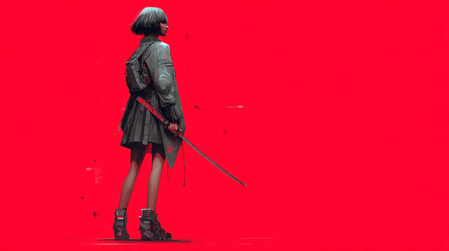
The tutorial’s second step is using Midjourney for the page imagery. For example, the hero background is this ronin image, which Claude’s layout and gradient overlays then compose into the hero you see in the bento above:
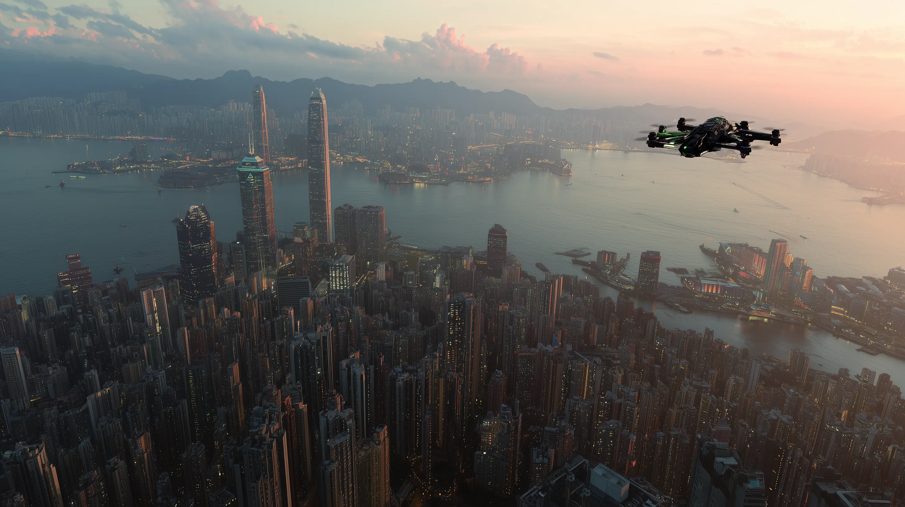
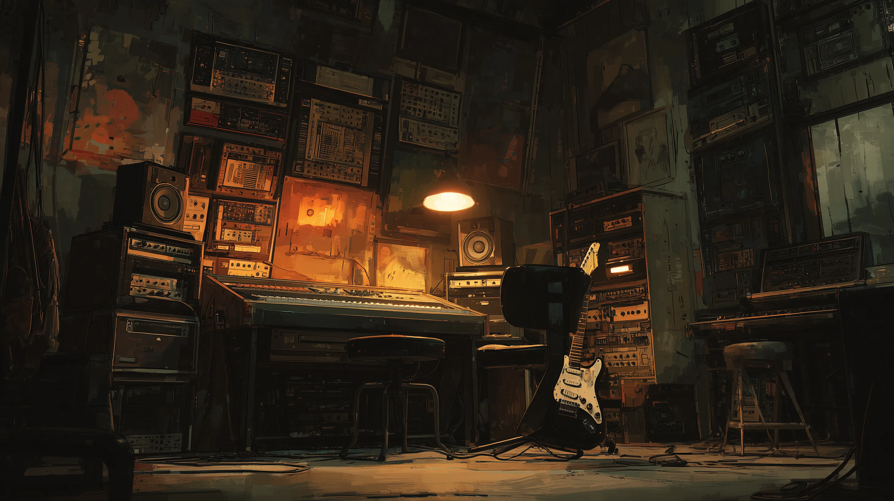
The feature and news imagery is Midjourney-generated too:
For the news section, Claude even split itself into three categories (patch / devlog / event), each with its own accent colour, and wrote convincing placeholder copy.
What I learned
1. A structural brief is already enough to get a design with character. I gave no visual direction, but from the single word “cyberpunk,” Claude derived a whole coherent language — neon, glitch, clip-path, dark surfaces. Give the AI a clear structure plus one strong genre/mood word, and its ability to fill the blanks is remarkable.
2. The output is a “prototype / handoff,” not production code. Claude even wrote a handoff README — listing every design token, per-section spec and breakpoint — then stated plainly that “these are design references, do not copy verbatim; rebuild them inside your real codebase using its framework.” The AI’s role is design exploration plus spec delivery; production still has to land in a real stack.
3. The images are placeholders — remember to replace them. Every image (hero, features, news) is a Midjourney placeholder. Good enough for a demo, but they must be swapped for final art before launch — and the hero was briefed as a “Large Video,” so the static image is only a stand-in.
Takeaway
Following one tutorial — from six sentences plus a few Midjourney prompts to a landing page with design tokens, five palettes, responsiveness and a handoff doc — is a good demonstration of where AI-assisted design is today: you set the direction and structure, the AI rapidly lays out a coherent, discussable starting point. The polish and production landing that follow are where the designer actually goes to work.